Thursday 19 December 2013

Bad shots replaced with good P1

2-1 Before
   
This shot is not an idea, good shot as you can't see the characters clearly and is not in focus.

                                                                           2-1 After
        
This shot is much better as their is nothing in the way of the characters and you can see them clearly. 
4-2 Before
      This is a bad shot due to the lighting on the characters is to much and doesn't look like the frame is more focused on the them rather then the whole shot.
4-2 After
 
This shot is better than previous due to the character being the parent of the shot. But you then could argue and say that the poster on the left make the shot bad as you don't need it in frame but then it works because it is in like with the other poster on the right and looks linear and does not descract you from what you are really looking at.
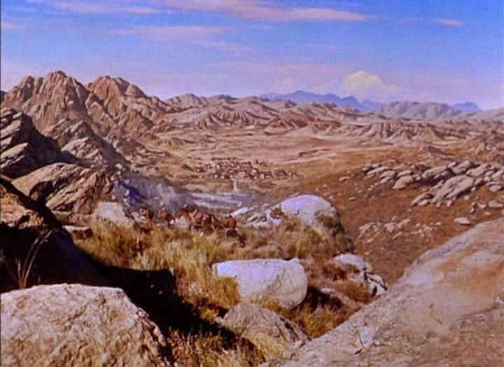
5-2 Before
This shot is unclear to what you are suppose to be looking at and also what it is frame as you have irrelevent things in frame like the computer screen don't need to be there, which they are distracting you from what you are really meant to be focusing on. 
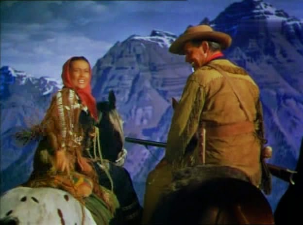
5-2 After
This is a much better shot as the lens is focused on the parent of the shot and their is nothing distracting you from what you they want you to look at, which is the character.
5-3 Before
 
This is a terrible shot as you can see the camara flash which makes it look amature and there is alot more going on in from which discracts you from what you want the audience to looka at.
5-3 After
This is a much improved shot as you only see what the cinematographier wants you to see.
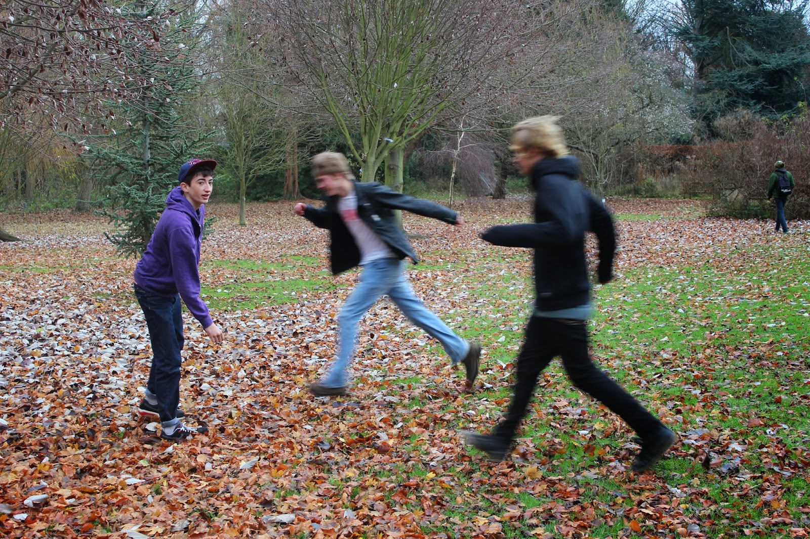
6-8 Before
The haracter are not clear at all and their are alot of irrelevent things in frame that descracts you from the main, their is alot of space in the frame aswell. 
6-8 After
   
     This is a much better shot as you can see more clearly what is going on. The charcter are much clearer here aswell. Although the tree is in shot and the bulding is wonky the character could of filled the frame more, the shot is much better than previous.

8-3 Before
   
This shots lighting is not very good due not not see the characters properly as the background light is alot more vibrant than  foreground.

8-3 after
 
The character stand out alot more in this shot and their is nothing to descract you from what you are meant to be looking at. 

I have replace the bad shots with better and improved shots to improve the quality of the over all film and the shots themselves.


Tuesday 17 December 2013

6 images that are Bad P1

the subject is in the middle of the frame and the framing is abit out as you can see the side parts of the wall which distracts u from the subject.

Their are too many things in the frame that distracts you from what you are actually looking at like the posters, lockers and frames pictures.

The framing isn't straight, you can tell my the lines of the window if the picture was tilted a little bit it might of made it look better. 

Subject is in the centre of the frame which auto balances the picture but doesn't look interesting or good.

The background of the image take your attention away from what you're meant to be looking at. 

The subject in the images is blurred and isn't very clear at all.

6 images that are Good P1

The frame is completely filled and the diagonal lines from the photo frames lead your eye line to the subjects.

Nothing in the back ground to distract you from the subject.

Blurred background gives you more of an effect as you focus more on the subject in the photo because that is the only thing in focus. 

The back ground in blurred and the for ground in focused which doen't distract you fromt he subject and the frame is completely filled.

The frame had been filled and the rule of 3rd apply as all 3 sections has all been filled in the frame. 

The background is the same, could be called plain as it all the same and nothing distract you from the subject.

P1. ANALYSING YOUR CINEMATOGRAPHY

RESEARCH ROTOSCOPING P2

A true pioneer of animation, Max Fleischer produced the Popeye and Betty Boop animated series, as well as the animated features “Gulliver’s Travels” and "Mr. Bug Goes to Town."


With his brother Dave, he founded the Fleischer Studios in the early 1920’s, which offered a less sentimental animated vision of the world than the rival Disney studio. Perhaps most importantly, Fleischer invented the rotoscope, a device that changed the look of animation forever.

During the 1930s, the Fleischers found themselves in an on-going competition with another animator -- Walt Disney. The Fleischers and Disney constantly raced one another to each new milestone in animation -- first sound cartoon, first color cartoon, and first feature. But according to Max Fleischer’s son, Richard Fleischer, Max and Dave often came in second, largely because the studio behind them, Paramount, didn't offer the support they needed.

While the technique is useful for animation, rotoscoping eventually became an important tool for visual effects in general. From the 1940s through the 1960s, U.B. Iwerks, a well-known animator, turned to effects work, where he pioneered the use of the rotoscope on films such as Alfred Hitchcock's “The Birds” (1963).


Rotoscoping is an animation technique in which animators trace over footage, frame by frame, for use in live-action and animated films. When trying to rotoscope an image you can use After Effects.


For this effect you will need three different shots, you will need the shot when the character first walks into the scene (1), then you will need when he is acting as if he is invisible (2) and also a background shot without the character in it.


  1. Rotoscope the character out of the shot number 2 using the rotoscope brush. 
  2. Turn the background layer into a composition layer. 
  3. Then right-click the composition layer and select composition settings.
  4. Select the preset – 1080p HD Film settings. 
  5. Make sure that Lock Aspect Ratio is ticked. 
  6. Change width to 1920*1.25. Then select okay. 
  7. Go to the Effects & Presets search bar and type in Displacement, drag Displacement Map onto the background layer. 
  8. Go to the Effect Controls and change Displacement Map to '2. Effect'. 
  9. Then Ctl Shft C to pre comp the layer. Call it actor and untick the box. 
  10. Go back to Effect Controls and see that the '2. Effect' has been changed to '2. Actor', change the colour to Luminance. 
  11. Set the Max Horizontal box to 55. 
  12. Set the next colour box underneath also to Luminance. Set the Max Vertical to 55. 
  13. Shut off the Effect layer (2) and you can now see that the character is gone but has left behind its shape. 
  14. In effects and presets search bar type contrast. Padlock composition layer, do this with padlock at the top & switch box below to actor. 
  15. Click on the actor composition tab, drag the brightness and contrast the to effect layer. 
  16. Put the contrast level to 55, close the actor composition tab.

Shot location Reece P1


file structure P1


Finished Animatic P1

Monday 16 December 2013

Working between Premier and After Effects P1

There are a few ways in which you can do this, toy an put your Premiere Peo footage into After Effect by simple highlighting the images and clicking 'File' - 'Export' - 'Media' then select the right format that you need and then simply click export. 

When you want to put the clips into After effects you have to highlight all the clips then right click and click replace with 'After effects composition'


The final way in which you can transfer the footage from Premier to After Effects is to select all of the clips by selecting first one, holding down Shift and then selecting the last one. You then need to hold and drag the clips holding down alt which will then duplicate the footage to wherever you are taking it to. This will then duplicate the full sequence into After Effects.

Thursday 12 December 2013

Breakdown sheets P1

Production design - part one P1


Matte painting research P1

matte painting is a painted representation of a landscape, set, or distant location that allows film-makers to create the illusion of an environment that is non-existent in real life or would otherwise be too expensive or impossible to build or visit. 

Here is a Matte painting of Iron Man of the stark industries.

Here is an example of a use of matte painting, it is used to create a scene or location that isn't real. This matte painting is a good example as its a good picture and could be quite a famous matte painting, the effect works really well and you don't notice it being a painting in the actually film but yet still give you an effect or realism


The first know matte painting shot was made in 1907 by Norman Dawn, who improvised the crumbling California Missions by painting them on glass for the movie Missions of California. He developed a technique that joined together a Photographer and a painting to enhance the environment that is being shot by the camera.

In the 1980's Matte painting was a from of CGI and was used on computers which highly developed to allow film makers to interact with the digital world.
By the 1990s the digitally composited live-action footage was used, the first film to used it was the well known Die hard 2. It worked well in this film and was brilliant for its time,
you don't notice that the scenery are paintings when you're watching it, unlike old films with the amateur matte paintings like western film


 when you can always see the effect happening on screen.

Green screen research P1

A green or blue background in front of which moving subjects are filmed and which allows a separately filmed background to be added to the final image.

Here is an example of green screen being used, this photo was from the film Avengers Assemble.


In 1898 'Four Head Are Bette Than One' film created by Georges Méliès performed the first visual effect which we now call green screen


The matte technique was used again on Edwin S. Porter’s 1903 The Great Train Robbery but this time not as magic trick but to create the effect of being on a train and realism which would of probable been a very successful film in its time as there wasn't anything like it, it was like magic in those times.
 

In the modern world Green screen is used nearly all the way through films, films these days could not develop or be near as good as they are without this technique, it is used all over the world and for nearly everything you see in films.

The blue screen method was developed in the 1930s at RKO Radio Pictures.

In 1950, Warner Brothers employee and ex-Kodak researcher Arthur Widmer began working on an ultraviolet travelling matte process. He also began developing bluescreen techniques: one of the first films to use them was the 1958 The Old Man and the Sea.


In this clip green screen would of be used through the whole clip as it creates a real feel of danger and excitement. Using this green/blue screen there were able to do make the suit change from a suitcase to the full body suit and this effect work really well and you don't even notice is a special visual effect.

They demonstrate in this clip how much green and blue screen is used, once you see this clip you'll never look at TV the same again. The use of Chroma key, which is the process of elimnating the green/blue and replacing it with something that you wish is a very good and effective technique to used as you can't tell the difference between what is real and what isn't. Their isn't a specific example to refer to in the film as all of it, it just amazing to watch and to observe, it opens your mind up to wonder to what extent to what you really see and hear on TV and film are real?

Green is currently used as a backdrop more than any other color because image sensors in digital video cameras are most sensitive to green, mimicking the human eye's increased sensitivity to green light. Therefore, the green camera channel contains the least "noise" and can produce the cleanest key/matte/mask. Bright green has also become favored since a blue background may match a subject's eye color or common items of clothing such as jeans.

Blue was preferred as a backdrop before digital keying became commonplace because of the existence of high contrast film that was sensitive only to the blue color.

A detailed history of Green screen:
http://zephyrphotoworks.com/greenscreenDetail/136

Tuesday 3 December 2013

Anamatic Review P1

Amy Brown's review of my Anamatic.

The Narrative doesn't really make sense as the voice for the characters changes through out the sequence making it to confusing to understand. It is not easy to see where the SFX fits in, from watching the sequence i am not completely sure where about the special FX takes place and also what they are. The dialogue is not very engaging and quite dry and is isn't very enthusiastic and need more enthusiasm added it to the speech of the actors. Many of he shots at the begging of the clips are quite long and boring to follow. I think there need to be more shots added into the beginning to make it more interesting. There sequence could be improved by adding more shots and make sure that the characters keep the same voices through out the sequence. By using more movement in to Anamatic it would much improve the the technical quality of whole Anamtic sequence.

Anamatic P1